design trends pp exportdesign trends pp
my design trends presentation
design trends pp exportdesign trends pp
my design trends presentation
this document contains the word document to follow my app build for my self-initiated
Although I was only able to physically create the log in page for my app design I learnt so much which will just have to be practised in order to be put into practise. This phase of my development was designed to make a start on the actual app but the main aim was to be able to teach myself to used the Xcode software, this phase has required an extensive amount of time watching and reading on how to used the software and create the different aspects within it and what each of the areas are used for.
I would have been happier if I had created more of the actual app but it was difficult to get to drips with the software and how it works without guidance, although this one page took many hours to create with time the actual development would become a lot quicker and more fluent in its stages.
The rest of my app will be developed within the coming years at University throughout my course, my aim is to have a completed app within a year not only working on it in my assignment work but also developing it within my own time. The final product will have a completed app along with a website advertising it with the link to the app store to download it.
This is a step by step guide of how I created the first part of my app using Xcode.
Although all I was able to complete was the opening log in page for the app due to the time scale given for this assignment this was due to having to research into the app extensively and self teach how to use it, I learnt everything through walk throughs i found online both written and videos but mainly it was through Treehouse which is a subscription community of industry professionals who make tutorials and references to aid other developers, I am unable to link in the specifics I used as due to the subscription nature the links just lead off to the home page.
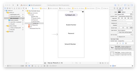
This is the log in page I created using Xcode, this was challenging in comparison to using my usual coding software Visual Studio Code which personally I find a lot easier to use.
This phase shows only adding and editing elements, there is no real design to the page as I was keeping it simple to make the development more time efficient.
Testing browser compatibility on 3 websites using https://www.browserling.com which has a limited amount of simulators available on the free version but I have chosen to use it as we was recommended to try https://www.browserstack.com but it wouldn’t work on the computers in college and wouldn’t open on either Chrome or Safari, I will check each website on the 4 that I feel are the most common of what I have available;
The 3 websites I will be checking are;
Deezer:


Deezers accessibility is very good as it is visible that the website is responsive to all platforms and browsers, this is a great example of good browser compatibility as it is all its main features appearing identical to each other while compensating for screen size


I began my Whitby Website using the template on the right but later decided that it wasn’t working for what I wanted and was looking more like a blog than a website, so I then switched to the template on the left which had a better layout to work with and gave it an overall better flow.
Each of these E-commerce websites are what I consider to provide good user experience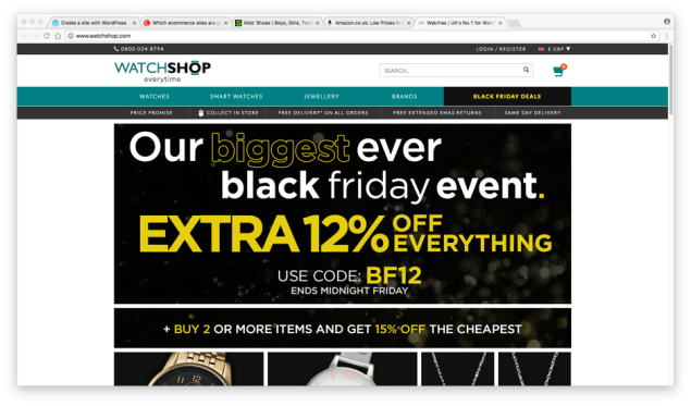
The Watch Shop website uses a very similar layout that very easy to navigate using a grid system, the search bar is located at the top of the page as it is loaded up to make locating a specific item easy to do, the navigation is simple but all has the delivery information directly below it so you are drawn to acknowledge it. They provide a basket to build up your shopping, you are able to create an account to make checking out faster.
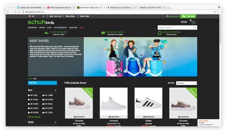
Schuh website have a simple navigation divided up into a few categories first then a lot of sub-categories to make refining items down very easy, delivery information is located just below this so that you are drawn in to see your options on how quick you can get the item you want, there is a search bar if you are looking for a very specific item, you are able to sign in to it to get offers sent to you. When you select an item and size it tells you straight away if they have them in stock online and in a specific store.
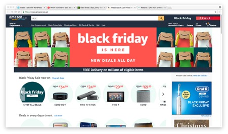
Amazon to me is the perfect E-commerce website as it has everything which is needed for the buyer when you have such a wide range of stock, products and suppliers. Any deals they have on have their own category which is easy to click and browse through just above the normal navigation bar, there is a large search bar across the top which is very noticeable when your first open the page. You create an account to make check out quicker and get recommendations on other products, you have a basket to build your choices but are able to save items for later to.
