User Interface – assignment 2 app development research

I started with listing the basic design principles needed for my app design, then broke each of these down to what would be required by each of these to give the best design with is the most accessible by users.

dav

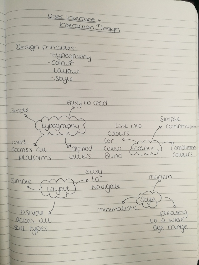
  • typography – after looking at what would be the most user and platform friendly typography to use I have decided that a custom font wouldn’t work as it may not be accessible for some of the platforms but it might also be difficult for people to read if they have any problems with sight or reading, which is why I have decided to use a font within the Arial family.
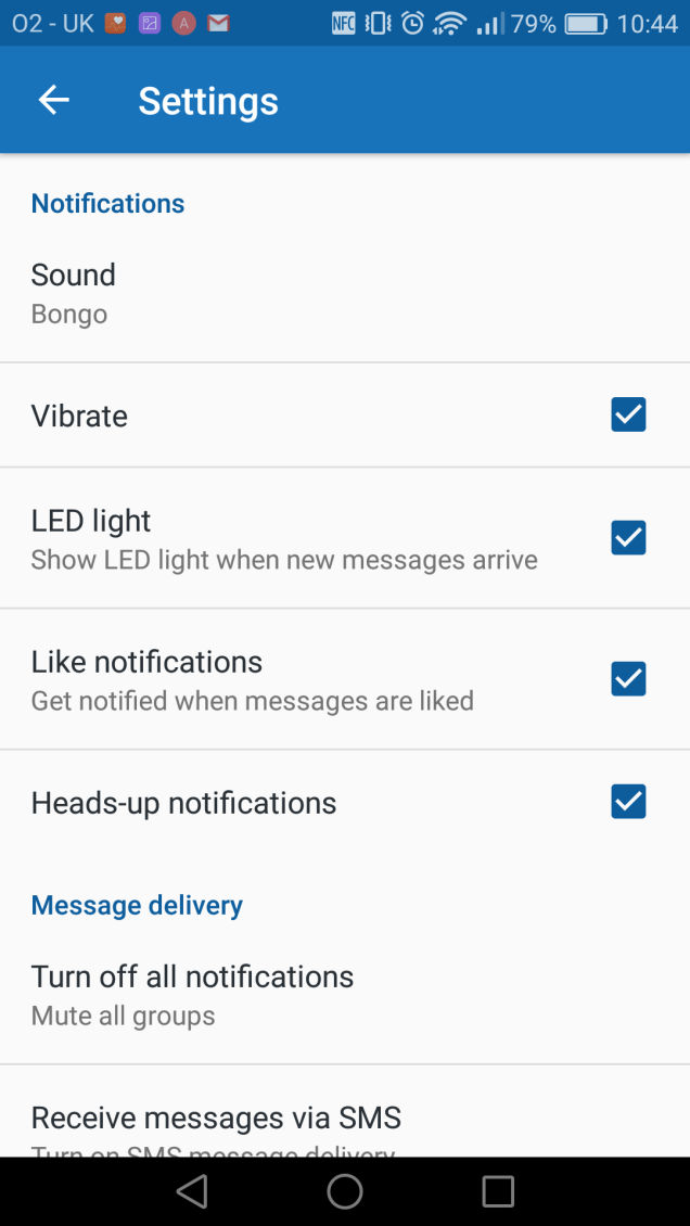
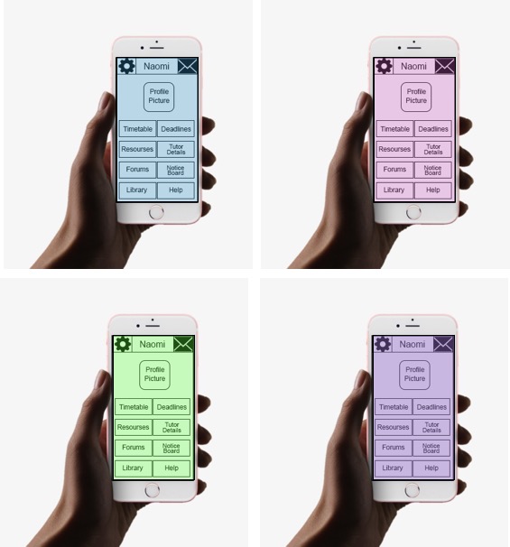
  • colour – a simple colour combination would be best approach for standard screen view using complimenting colours which also works best for anyone with a colour blindness, but to combat these problems the app colours should be customisable to be able to suite any need or preference which will be looked at more in the style section but text should be available in black or white with background colour been more customisable.
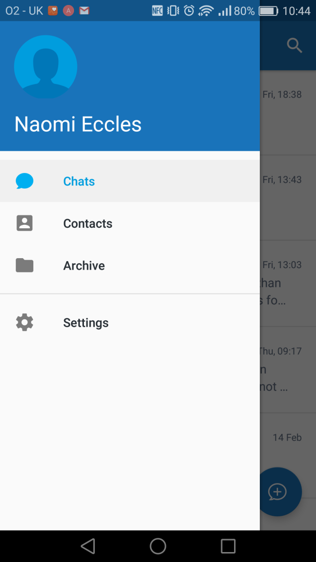
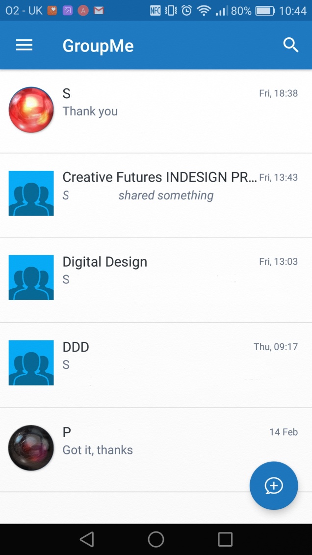
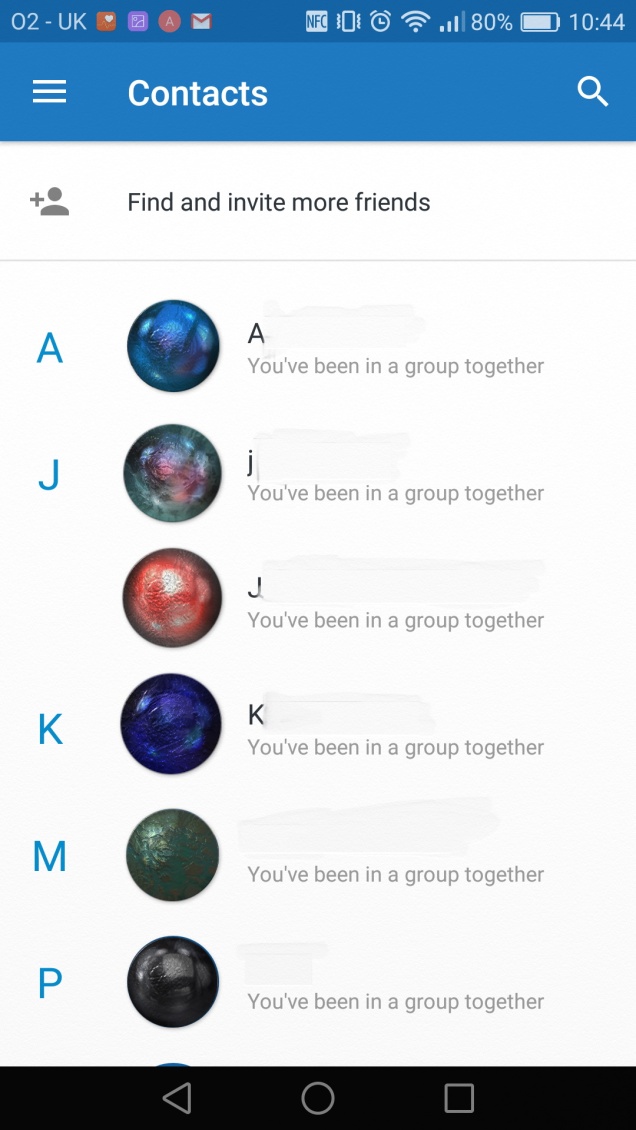
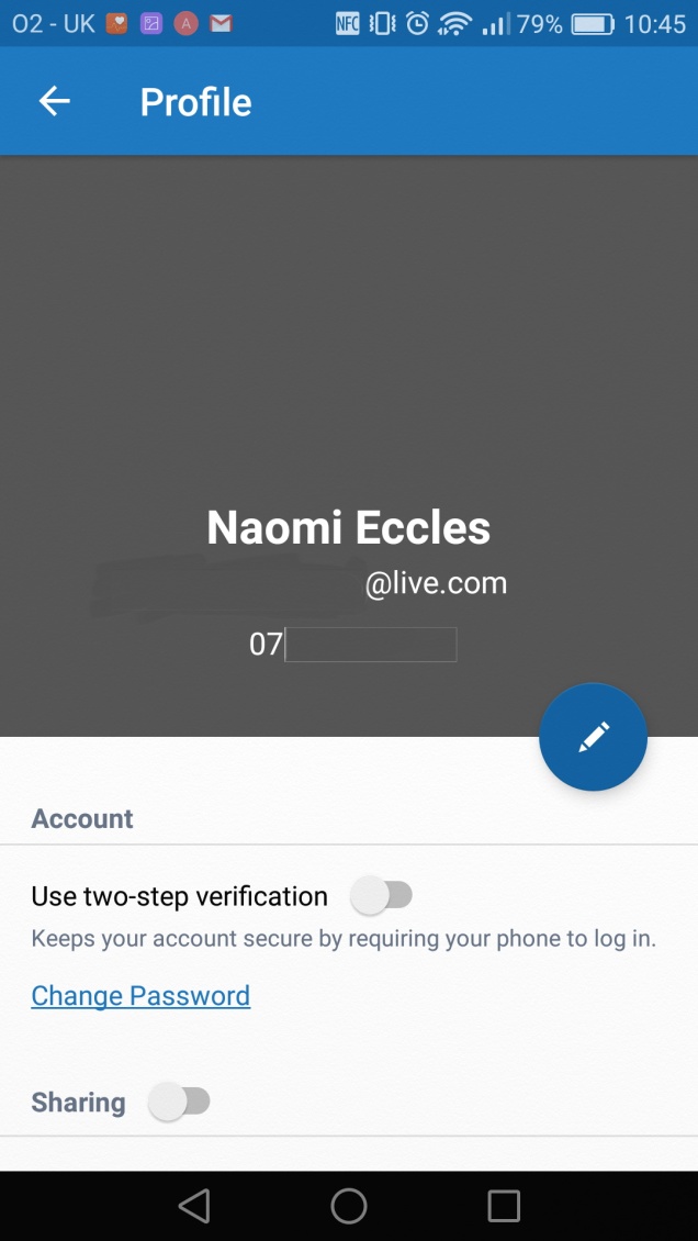
  • layout – the layout needs to be easy to navigate on a range of devices so one design which is responsive is the best way to keep it consistent as it will be used over a range of devices and platforms by a wide range of computer skills from very basic to very competent. It should have a simple menu button which is constantly visible for easy navigation although the layout will develop in the design stage the basics above are the main areas to be covered, it should also have a very simple log in to create security for the information stored on the app, it would also provide reassurance to those who are sceptical about technology.
  • style –style is a very personal approach especially for something which would be used as much as this app which is why I have designed it be too able to change the background colour and text colour but this will be the only thing which is customisable as the rest of the styling will be kept very simple and minimalistic to appeal to the wider range of users as it would be more pleasing to a vaster age range. The use of a minimalistic design is within current trends of modern design.

User Interface – assignment 2 app development research

Breaking down the “GroupMe” app

Screenshot_2018-03-19-10-44-06
Very simple menu which has only necessary links to the sections within the app these are; profile, chats, archived chats, and settings although there are features which they advertise which are not available on my phone with I will look into
Screenshot_2018-03-19-10-44-15
this view shows the section containing the active chats it has very simple search tool in the top right corner, menu button in the top left and a new chat button in the bottom right
Screenshot_2018-03-19-10-44-31
The contacts section is laid out alphabetically by the first name which the user has chosen to use which may cause problems if they have chosen to use something other than their actual name, but they are able to add a photo which once again they can use anything which will not really help with identification which isn’t any help even with the search function as it uses the previous information for its results. Inviting people is very difficult and takes a lot of time and messing about as we experienced while setting it up ourselves.
Screenshot_2018-03-19-10-44-58
It gives a lot of settings options for the app to make it more user friendly and accessible but some of the changes made are not executed in the app as even with all notifications turned on we still struggle to get any notifications for our group chats and if we do many of them are extremely delayed which is an enormous downfall for an instant chat option.
Screenshot_2018-03-19-10-45-43
The profile shows the very basic information; display name, phone number and email address. It also gives you the option to link in social media but I feel that this option is not required for a college or university app as it could be more of a distraction then educationally beneficial, you are also able to edit your information through this section

Overall the app is fairly easy to use but has a lot of room for improvement. I will keep the idea of the very simple navigation and profile view as I feel that these are easy to use despite your computer skills. But there is a lot of room for improvement on the other areas including adding more security on what you are able to display as your profile to make finding a student of tutor easier.