Now I have all the images saved and my colour pallet worked out I started looking into the user journey by mapping this out (as seen below) and working on a basic wireframe design (as below)
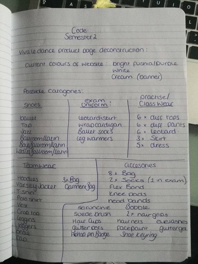
This image shows the breakdown of the items which are available on the current website, the list was pretty extensive so I tried to develop categories to create some organisation but through this I found that I would have to focus on just one category for this assignment, I chose to focus on shoes as this category contained defined subcategories which was easy to define to use for the query aspect of the brief. 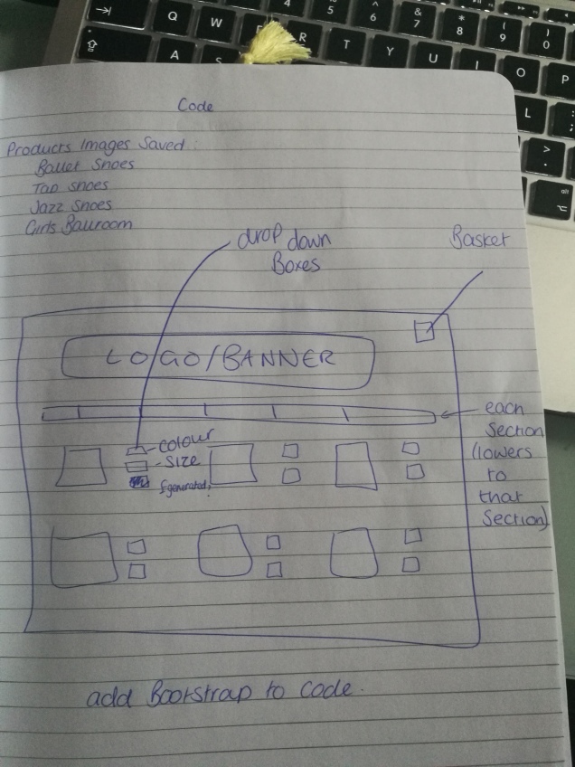
I created a basic wireframe design to work from, I designed a very simple layout and navigation thinking back to accessibility, the products would be displayed in a grid as to keep everything neat and organised, I decided I wanted to be aspirational with my code and add drop down boxes containing selections which are available to reduce the about of visual information making only what was required visible to the user when they choose to see it, I also wanted to try and add a shopping basket to my site to complete the e-commerce side of it.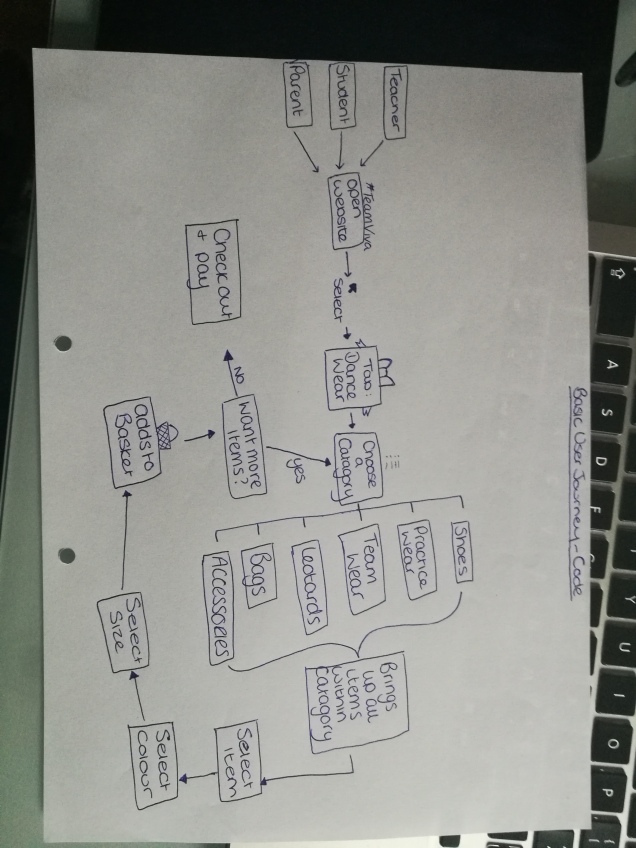
My basic user journey started by thinking of who would be using the website and i concluded that there would be two main users; teachers and students/parents, due to this I thought that the overall site should have a log in section to distinguish between the two as certain information may only be accessible to teachers as only they require it, this would just load the home page and the option to sign in would be available through a link or button. From my wireframe design I chose to have a tabbed menu across the top below the initial logo which was to be used as a banner image, each of these tabs was based on the current ones used on the website, for my assignment looking at the selling page the user would be able to select dance wear which would open up the page I have designed which would be the same as the home page apart from the tabs have now changed to the categories I had deciphered from the substantial list of products (for this assignment I have only done the shoes page), this will then bring up all the items available within that category as a grid of photos with the drop down box to the side or under the image (which will depend on what I am able to code), it will then have a search section at the bottom of the page to be able to filter through the products easier, and finally I hope to be able to have an option to add the items to a basket.
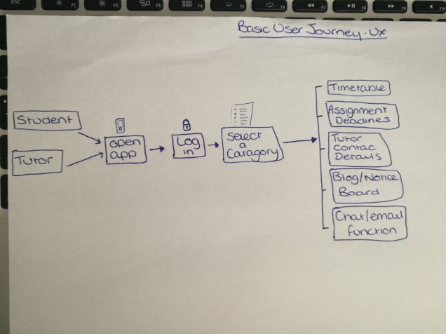 from this information I have found what are the key features which everyone thought we required within the new app, the security level people expect from it and what parts a student can add to and what parts only a tutor can edit or create.
 This is a User Journey based on our University website which is used to store and deliver information to us, I had to show the user journey from the home page through to the student handbook page.