Each of these E-commerce websites are what I consider to provide good user experience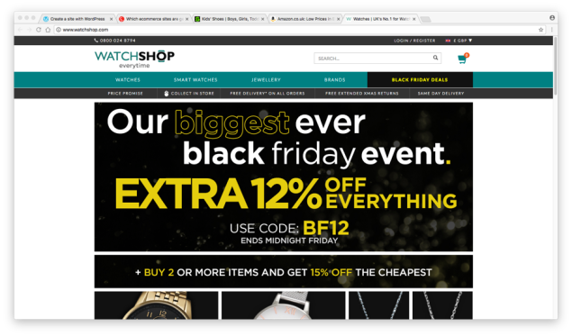
The Watch Shop website uses a very similar layout that very easy to navigate using a grid system, the search bar is located at the top of the page as it is loaded up to make locating a specific item easy to do, the navigation is simple but all has the delivery information directly below it so you are drawn to acknowledge it. They provide a basket to build up your shopping, you are able to create an account to make checking out faster.
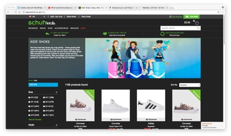
Schuh website have a simple navigation divided up into a few categories first then a lot of sub-categories to make refining items down very easy, delivery information is located just below this so that you are drawn in to see your options on how quick you can get the item you want, there is a search bar if you are looking for a very specific item, you are able to sign in to it to get offers sent to you. When you select an item and size it tells you straight away if they have them in stock online and in a specific store.
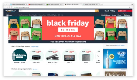
Amazon to me is the perfect E-commerce website as it has everything which is needed for the buyer when you have such a wide range of stock, products and suppliers. Any deals they have on have their own category which is easy to click and browse through just above the normal navigation bar, there is a large search bar across the top which is very noticeable when your first open the page. You create an account to make check out quicker and get recommendations on other products, you have a basket to build your choices but are able to save items for later to.
