(post was ongoing from November 2018)
I started by looking at how the current logo and menu appeared on both mobile and desktop since the client didn’t want many changes to this aspect of the website each was displayed prominently across the top of the page.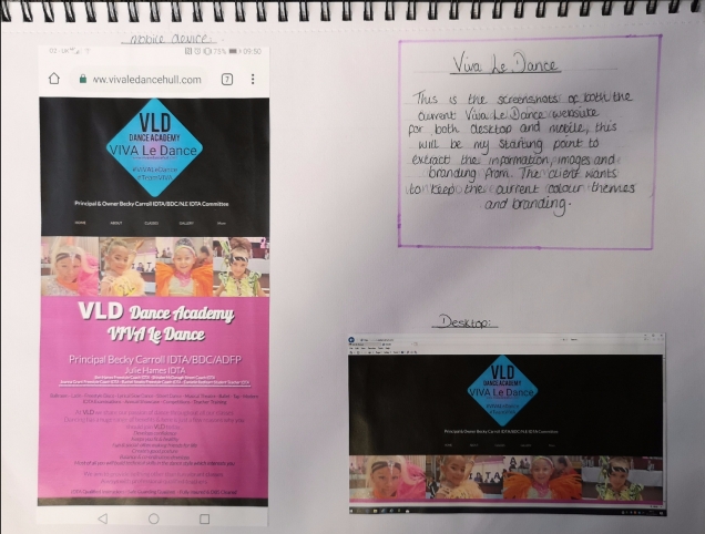
Collecting information and images:
I chose to collect all the relevant information and images I required before starting to code so that they are all present in the correct files before starting to save working backwards to match up their location with the codes source, the text and timetable information was easy to acquire and did this within a day compared to the two weeks I gave myself on my Gantt chart as it was all present on the website already so I compiled it all together in a word document for reference. The Images was gathered slowly as some came from the website while other was sent by the client but this still stayed within its designated timeframe given.
colour theme:
To create my colour theme I used a website called coolers.co.uk, this allowed me to upload a screenshot of the current website and extract the exact colours from the image giving me the hex colour codes to be able to implement straight into the website code but also gave the RGB code as an alternative, I have chosen to focus mainly on the black, white and turquoise colours mainly as these have a more professional look, follow current trends and when tested don’t show any obvious issues with sight problems. By using this tool I saved time which was allocated in my Gantt chart.


Initial build phase 1:
For phase one I simply created the relevant files and each of the required pages for the website and created my basic CSS and linked it in, by doing this I created the six pages I required with black backgrounds ready to start designing on, this phase only took a couple of hours compared to my original estimated timescale.
Initial build phase 2:
Phase 2 was to add the logo and menu bar throughout the website, the image was added and checked first with all the alterations on boarder and padding to get it in the perfect central position, the text was then overlaid the bottom of the image in white to contrast the black. The menu became a problem getting it all to line up evenly and on one line, I then had to link each of the menu tabs to the correct pages for navigation and add the code to make it a sticky menu like the client requested. This code had to then be copy onto each of the pages, the styling for it begun for things like hoer and active options, in all this process took longer than the 7 days I had allocated but with the initial start up taking very little time I was not put behind target as it just about evened out to been on track.
Client review:
After creating this very basic design and navigation I tried to arrange to meet up with the client to check that the navigation was satisfactory before continuing with further development and to discuss the options for the class timetable. Upon meeting up with the client they was happy with the new navigation and how it was progressing, we discussed the timetable options to which they was not really sure what they required as long as it was displayed better then how it was currently, and we decided that if the idea of having times involved created an issue we would scrap them and just list the different call information.
Development phase 1:
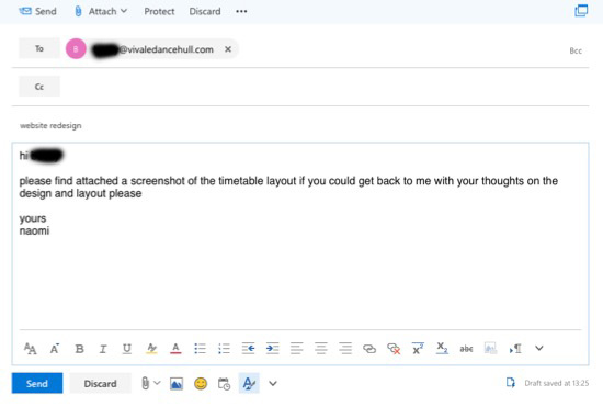
After meeting with the client I set about creating the timetable that was required, after trying may different ways using the timescale was just not an option it created an enormous table due to how spread out the classes are over the week, so I created a simple table to display the information and sent a screenshot of this to the client to get their opinion on which they was happy with so I then went on to style the table further.
Development phase 2:
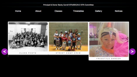
My initially discussion with the client with regards to the gallery page was that we was going to display the images in a more visually pleasing manor than the current way of displaying them all on one page stacked up resulting in constant scrolling for the user. For this I used the tool “Slick” and generated a multiple image carrousel to display them three at a time making the entire page look more professional. To do this I had to ad JS into my code. I have added 20 images and styled them all to have the same boarder and text making it more pleasing to look at.
Development phase 3:
I started to try and link in the social media on the “notices” page as Facebook is the clients main line of communication and advertisement, although I have added the code onto the website due to not being logged into the clients social media I am unable to create to link between the two I would therefore do this with the client present in order to stop any risk of personal information or passwords been leaked .
Client review:
Due to the time of year the client has become very busy and it is difficult to arrange to meeting to show what has been created so far, through this the website although it is to schedule it is not complete but the remaining information and adaptations to be made would be a simple process to do before the website goes live.
